Adding Custom Content to the Dataset Details Page
This tutorial will guide you through the process of adding an additional section on the datasets details page in piveau-hub-ui. This is a common scenario to customize the UI for specific needs. The methodology can be easily applied to other sections and pages of the UI.

Requirements#
- A locally running version of piveau-hub-ui
Note
This tutorial was made using @piveau/piveau-hub-ui-modules v4.2.x.
Background#
While common customization patterns such as changing how piveau UI interacts with external services or the visibility on certain elements through user-config.js or adjusting visuals via CSS styling covers the majority of customization desires, sometimes it is necessary to extend piveau ui on a deeper level. This can be achieved by leveraging the Slots features of Vue.
Creating a wrapper component#
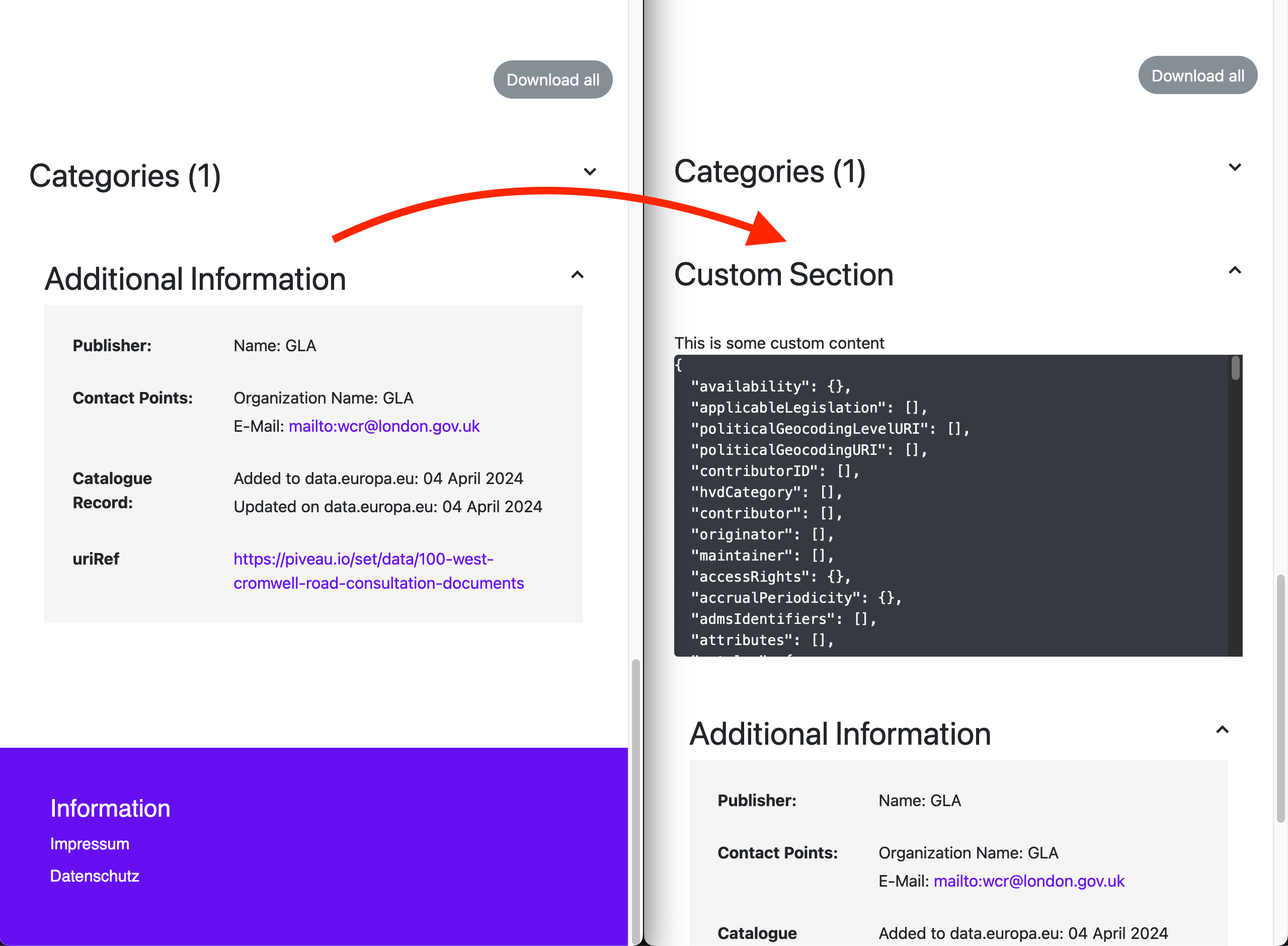
You need to override the DatasetDetailsFeatures component with a new component DatasetDetailsFeaturesComponent that wraps the DatasetDetailsFeatures component to customize the functionality. Here, you add another collapsible section with title "Custom Section" and content "This is some custom content" below the "Categories" collapsible section, displaying the current dataset data-model.
To do so, create a wrapper component src/components/DatasetDetailsFeataures.vue. By defining the after slot's content of the DatasetDetailsFeatures component with our own template, you can add a new section to the dataset details page. Since the after slot provides the internal dataset data-model, you can access it in our template to display it in a code block.
Slots
The <slot> element is a Vue component to create a flexible template that can then be populated with custom markup. You can find available slots in our components by navigating through our documentation and source code. To learn more about slots, visit Slots.
Here is what your wrapper component looks like:
/src/components/DatasetDetailsFeaturesCustom.vue:
<template>
  <!-- Passthrough all attrs, including props -->
  <dataset-details-features v-bind="$attrs">
    <template #after="{ dataset }">
      <div class="mt-2 flex-column dsd-feature w-100">
        <div>
          <dataset-details-feature-header title="Custom Section"
            :arrowDown="!isDisplayed" tag="keywords-toggle" :onClick="() => isDisplayed = !isDisplayed" />
        </div>
        <div v-if="isDisplayed" class="row mt-4 w-100">
          <div class="col-11 offset-1">
            <div>This is some custom content</div>
            <div class="rounded bg-dark overflow-auto" style="max-height: 300px;max-width: 100%">
              <pre style="white-space: pre-wrap;"><code class="text-light">{{ JSON.stringify(dataset, null, 2) }}</code></pre>
            </div>
          </div>
        </div>
        <div>
        </div>
      </div>
    </template>
  </dataset-details-features>
</template>

<script>
import {
  DatasetDetailsFeatures,
  DatasetDetailsFeatureHeader,
} from "@piveau/piveau-hub-ui-modules";
import { defineComponent } from "vue";

export default defineComponent({
  name: "DatasetDetailsFeaturesCustom",
  data() {
    return {
      isDisplayed: true,
    }
  },
  components: {
    DatasetDetailsFeatures,
    DatasetDetailsFeatureHeader,
  },
})
</script>
To tell @piveau/piveau-hub-ui-modules to use DatasetDetailsFeaturesCustom instead of DatasetDetailsFeatures, go to the main.ts file and adjust the following line to add the DatasetDetailsFeaturesCustom component:
// main.ts
import DatasetDetailsFeaturesCustom from './components/DatasetDetailsFeaturesCustom.vue';

configureModules(app, store, {
  // ...
  components: {
    DatasetDetailsFeatures: DatasetDetailsFeaturesCustom,
  }
});
You can see the result on your browser!